Choosing two-tone baseball caps wholesale can be daunting for many. Users frequently face difficulties in identifying the right color combinations that will appeal to their target audience or align with brand aesthetics. A common pain point arises when individuals select colors that clash or fail to resonate with desired promotional effects. For instance, a local sports team might want caps that reflect their colors, but mismatched tones can lead to poor merchandise sales. Understanding how to choose complementary colors not only enhances product appeal but can also resonate better with your audience. This article will guide you through the process, addressing common challenges and providing actionable advice based on real user experiences.
Preparation: Tools and Resources for Color Selection
Before diving into the process of selecting complementary colors for your two-tone baseball caps, gather essential materials and tools:
- Color Wheel: Obtain a color wheel, which is crucial for visualizing color relationships. Use tools like Adobe Color or Coolors to access digital color wheels.
- Fabric Swatches: Collect samples of different materials to see how colors appear in real life and under various lighting conditions.
- Design Software: Utilize applications such as Canva or Photoshop to experiment with color combinations digitally.
Step-by-Step Guidance to Selecting Complementary Colors
- Understand the Color Wheel: Familiarize yourself with the color wheel, including primary, secondary, and tertiary colors. This will help you comprehend basic color theories, like complementary (opposite colors) and analogous color schemes (adjacent colors).
- Identify Your Base Color: Choose a base color that aligns with your brand or event. For instance, Hengxing users often start with a popular shade like navy blue, commonly recognized for its versatility.
- Use the Color Wheel: Once you have your base color, refer to the color wheel to find complementary colors. For navy, consider shades like orange or coral that naturally enhance the navy without overwhelming it.
- Consider Brand Identity: Evaluate how your chosen colors align with your brand's personality. A case study from a community sports league showed that using bright and energetic colors led to a 25% increase in merchandise sales.
- Digital Simulations: Utilize graphics software to simulate your color combinations on mockups of two-tone baseball caps. This digital representation can clarify how colors work together.
- Solicit Feedback: Before finalizing your choices, present your designs to a focus group or social media followers. Often, community feedback can illuminate preferences you may have overlooked.
- Finalize Your Selection: Based on feedback and your initial research, narrow down your options to two or three color combinations. This step ensures that you're aiming for the mix that resonates the best.
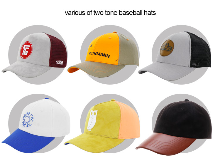
Common Errors and Solutions in Color Selection
Many users make frequent mistakes when selecting colors for two-tone baseball caps. Here are a few common errors and solutions:
- Choosing Colors Based Solely on Trends: Sometimes, users pick colors that are trending without ensuring they match their specific brand identity. Solution: Always bring it back to your brand’s core message and target demographic.
- Ignoring Lighting Conditions: Colors can look different in various lighting. Solution: Always test fabric swatches under natural and artificial light to see how colors hold up.
- Mainly Classic Combinations: Relying too heavily on traditional combinations can lead to uninspired designs. Solution: Don't be afraid to experiment with out-of-the-box combinations that may surprise you with their appeal.
Summary and Suggestions
Choosing complementary colors for two-tone baseball caps requires a blend of creativity, research, and awareness of brand identity. By understanding the color wheel, utilizing design tools, and seeking feedback, you can craft a visually appealing and marketable product that stands out. Make sure to embrace experimentation—sometimes the best results come from unconventional choices!
FAQ
- 1. What are some popular color combinations for caps?
- Popular combinations include navy and orange, red and black, and green and gold. These pairings not only complement each other visually but also attract attention.
- 2. How can I ensure my caps are appealing to my target audience?
- Conduct surveys or focus groups within your target demographic to gather insights into their preferred colors and styles.
- 3. How do materials affect color perception?
- Different materials can absorb and reflect light differently. For example, matte finishes may show duller shades compared to glossy materials, which enhance vibrancy.